How to Design an Online Course Website That Actually Converts
Mar 11, 2026Many people launching an online course focus entirely on the content.
They spend weeks recording videos. Building modules. Sequencing lessons.
Then they hit publish — and nothing happens.
No sign-ups. Trickle traffic. Crickets.
Here's the uncomfortable truth: the course was probably fine. What failed was the website around it.
Your course website isn't a container for your content. It's a sales environment. Every layout decision, every headline, every color choice either builds trust and moves visitors toward enrollment — or it creates friction that sends them away.
This article breaks down the specific design principles that separate course websites that convert from ones that just exist.
The Real Reason Course Websites Don't Sell
Most course creators build their website the same way they organize a Google Drive folder — logically, but not persuasively.
They add an About page. A course page. A checkout. Maybe a blog.
And then they're confused when people visit and leave without buying.
Here's what's actually happening: a visitor lands on your site with a single, silent question — Is this for me? — and your design has about five seconds to answer it before they're gone.
When the hierarchy is cluttered, the headline is vague, the page doesn't flow, and the call to action is buried — the visitor answers their own question: probably not. And they leave.
The sites that convert answer that question immediately and then methodically eliminate every remaining doubt before asking for the sale.
Design is not decoration. It is the argument.
A well-designed course website does three things, in sequence:
- Clearly explains the transformation the student will experience
- Builds genuine trust in the instructor's credibility and method
- Creates a frictionless path from interest to enrollment
If any one of these breaks down, conversion suffers. Let's look at how to get all three right.
The Three Core Pages (And What Most Creators Get Wrong on Each)
Most course websites become complicated too quickly. Creators add resource pages, FAQ pages, community pages, free download pages — before the three foundational pages are even working properly.
Get these three right first. Everything else is secondary.
1. The Home Page
The home page's job is narrow: help the right visitor understand that they're in the right place, and point them toward the course.
That's it.
The most common home page mistake is leading with who you are instead of what you solve. A headline that reads "Welcome to [Your Name]'s Academy" tells a visitor nothing useful. But a headline like "Learn to Build a Profitable Online Course — Even If You've Never Launched One Before" immediately does three things: it names a result, implies a process, and addresses an objection.
A high-converting home page typically includes:
A result-focused headline in the hero section. Not a clever tagline. Not your brand name. A plain-English description of the outcome someone gets from working with you or taking your course. Make it specific enough to be credible, not so specific it excludes people prematurely.
A short value statement (2–4 sentences below the headline) that expands on the result and names the audience. "This course is designed for coaches and consultants who know their subject deeply but struggle to package it into a course that sells."
A mid-page instructor section — not a full biography, but enough to establish credibility. One photo. Three to five sentences. Focus on why you're qualified to teach this specific thing, not your entire career history.
Social proof in the form of testimonials, student counts, or course completions — whatever you have. Even two or three strong student quotes dramatically increase trust on a home page.
A clear path forward — a prominent CTA button pointing to the sales page. Visitors shouldn't have to figure out what to do next.
The home page is not the sales page. It's the bridge that gets qualified visitors to the sales page.
2. The Course Sales Page
This is where the decision happens, and it needs to be the most carefully designed page on your site.
A weak sales page is usually too short — it describes the course instead of selling the transformation. A long but unfocused sales page is equally ineffective because it overwhelms rather than guides.
The structure that consistently works follows the natural arc of how a buyer thinks:
Open with the problem. Before you introduce your course, you need to earn the reader's attention by demonstrating that you understand exactly what they're struggling with. Specific language here is everything. "You've been meaning to launch your course for months, but every time you sit down to start, you get overwhelmed by tech, second-guess your content, and end up doing nothing" lands differently than "You want to launch a course but aren't sure where to begin." Name the friction, the delay, the feeling of spinning your wheels.
Introduce the result. What does life look like after the course? Don't lead with features (9 modules, 47 lessons, 3 bonuses). Lead with the outcome. "By the end of this course, you'll have a fully built, ready-to-launch online course — with a sales page, email sequence, and pricing structure in place."
Present your method. Explain why your approach is different, and why it works. This is the bridge between the result they want and the trust they need to purchase. Your method is your credibility argument. If you have a specific framework or system, name it and explain the logic behind it.
Show the curriculum. Now you can introduce the modules — but frame each one around what the student gains or can do after completing it, not just what the module covers. "Module 3: Pricing for Profit — Learn how to price your course confidently without guessing, undercharging, or chasing competitors."
Prove it works. Testimonials should be specific, not generic. "This course changed my life" is nearly useless as social proof. "I launched my course three weeks after finishing this program and made $4,200 in my first week" is the kind of specific result that converts skeptics. Use real names, photos where possible, and results that mirror your ideal student's situation.
Handle objections. An FAQ section at the bottom of the sales page isn't filler — it's your chance to address the doubts a visitor won't say out loud. "What if I don't have a big audience yet?" "What if I'm not tech-savvy?" "How is this different from [free YouTube tutorials]?" Answer these questions honestly. It demonstrates confidence in your product and reduces buyer hesitation.
Close with price and enrollment. Show the price clearly. Don't hide it or bury it. Visitors who scroll to the bottom and can't find the price will leave. If you offer a guarantee, state it plainly and make it generous — a 30-day money-back guarantee removes the final psychological barrier for many buyers.
3. The About Page
People buy from instructors, not from courses.
Two courses on the same topic, priced identically, with nearly identical curricula — the one with the more compelling instructor story will consistently outsell the other. This is the power of the About page, and most creators waste it.
The most common mistake: treating the About page like a resume. Chronological career history, impressive-sounding titles, academic credentials. None of that builds the emotional trust that drives a purchase.
What works instead is a story with a turning point.
Describe where you were before you figured this out. What problem were you facing? What did you try that didn't work? How did you finally crack it? Then connect that journey directly to why you created this course and who it's designed for.
This structure does something a résumé can't: it makes you relatable. A visitor sees their own situation in your story, and your credibility becomes personal, not just professional.
Keep the About page focused. A photo that feels like you — not a stiff headshot. Three to five paragraphs. And a CTA at the bottom linking back to the course, because visitors who read your full About page are warm and shouldn't have to hunt for the next step.
Layout Principles That Guide Visitors Toward a Decision
A good layout is invisible. Visitors don't notice it because it never makes them stop and think. Everything is where they expect it, the hierarchy is obvious, and the next action is always clear.
A bad layout is memorable — for the wrong reasons.
Here's how to get it right.
Visual Hierarchy: Show People Where to Look
Online visitors scan before they read. Eye-tracking studies consistently show that users make an F-pattern or Z-pattern pass over a page before committing to actually reading. Your design needs to work with that behavior, not against it.
Visual hierarchy means making your most important information visually dominant. The headline should be the largest text on the page. Subheadings should be clearly differentiated from body text. White space should separate distinct ideas so the eye can parse sections quickly.
In practice: if someone squints at your page until it blurs, the most important message should still be legible through the blur. If what's visually dominant is a decorative image or an unimportant subheading, your hierarchy is off.
One Primary Action Per Page
This is one of the most violated principles in course website design. Creators pile on CTAs — "Enroll now," "Download my free guide," "Join my newsletter," "Book a call," "Follow me on Instagram" — and then wonder why conversion is low.
Every additional action you offer reduces the likelihood that visitors take the primary action. This is well-established in both design research and direct response marketing. Choice creates hesitation. Clarity drives clicks.
Each page should have one primary goal:
- Home page → Get to the sales page
- Sales page → Enroll in the course
- About page → Return to the sales page
Secondary actions (like an email signup) can exist, but they should be visually subordinate to the primary CTA. They should never compete with it.
Section Flow: Every Section Earns the Next
Think of your sales page as a conversation that mirrors how a buyer naturally thinks. Each section earns the visitor's attention by resolving their current uncertainty and creating the next logical question.
A proven sequence:
- What is this? → The headline and hero section
- Is this my problem? → The problem section
- What will I get? → The transformation and outcome
- How does it work? → Your method and curriculum
- Has it worked for others? → Testimonials and social proof
- Why should I trust this person? → Instructor credibility
- What does it cost, and is it worth it? → Pricing and guarantee
- What if I still have questions? → FAQ
- How do I sign up? → Final enrollment CTA
When sections follow this arc, visitors rarely feel lost or pressured. They feel guided — and that trust translates directly into sales.
Typography: The Design Element Most Creators Ignore
Typography is responsible for more of your site's perceived credibility than most course creators realize. It affects how professional your site looks, how easy it is to read, and whether visitors stay long enough to be persuaded.
Use two fonts maximum. One for headlines, one for body text. This isn't a limitation — it's discipline. Sites with four or five different fonts feel scattered and amateurish, even if the individual fonts are beautiful.
For headlines, a slightly heavier or more distinctive typeface works well — it creates visual contrast with the body text and signals hierarchy. For body copy, prioritize legibility over personality. Readers process clean, readable fonts with less cognitive effort, which means they absorb more of your argument.
Size matters more than most creators think. Body text smaller than 16px consistently hurts readability and conversion, especially on mobile. Headlines in hero sections should be large enough that the key message is unmissable — 48px and above on desktop is a reasonable starting point.
Line length and spacing. Body text that spans the full width of a desktop browser is exhausting to read. Aim for 60–75 characters per line, which typically means constraining your text blocks to around 700–750px. Line height of 1.5–1.7 for body text gives readers room to breathe.
These aren't aesthetic preferences. They're legibility mechanics — and legibility directly affects how much of your sales argument actually reaches the reader.
Color: How to Use It to Build Trust and Drive Action
Color is where course websites either look credible or fall apart. And the most common mistake isn't a bad color — it's too many colors.
Establish a three-part palette and stick to it:
- Primary brand color — used for major headings, key sections, and brand accents
- Accent color — reserved almost exclusively for calls to action (buttons, links)
- Neutrals — white, off-white, light gray, dark gray, near-black for backgrounds and body text
The strategic purpose of this restraint: when your CTA button is the most visually distinctive element on the page, it naturally draws the eye. Visitors don't have to hunt for the "Enroll Now" button because it stands out in the visual field. When everything is colorful, nothing stands out.
Color and trust. Certain colors carry associations that affect perceived credibility. Cooler palettes (deep blues, grays, navy) are often associated with expertise and authority. Warmer palettes (gold, rust, terracotta) can feel more personal and approachable. Neither is inherently right — the question is whether your palette matches the tone of your brand and the expectations of your audience.
Contrast is non-negotiable. Light gray text on a white background looks elegant until you try to read it in sunlight on a phone screen. WCAG accessibility guidelines recommend a contrast ratio of at least 4.5:1 for body text. Beyond accessibility, high-contrast text simply keeps more people reading — and that's good for conversion.
What a Well-Designed Course Website Actually Looks Like
To make this concrete, here's how a coherent course sales page structure typically looks in practice — specifically on a platform like Kajabi:
Hero section. Full-width background (image or solid color). Large, result-focused headline. A supporting sentence naming the audience and timeline. A single CTA button ("Start Learning" / "Enroll Now"). On Kajabi, this is often a hero block with the button linked directly to the offer checkout or an anchor lower on the page.
Problem section. A few short paragraphs that name the exact frustrations your ideal student is experiencing. No images needed here — just clean, well-spaced text that reads like you're speaking directly to one person. This section builds the emotional case for the course.
Transformation section. What does success look like? Frame it around a before/after. "Before this course, you have an idea. After this course, you have a system." Keep it visual if possible — a side-by-side layout or a simple visual comparison can communicate transformation faster than paragraphs.
Method section. Your framework or approach. Give it a name if you can. A named method ("The 5-Phase Course Builder System") feels more substantial and memorable than "my process." Include a simple graphic or numbered breakdown if the method has distinct steps.
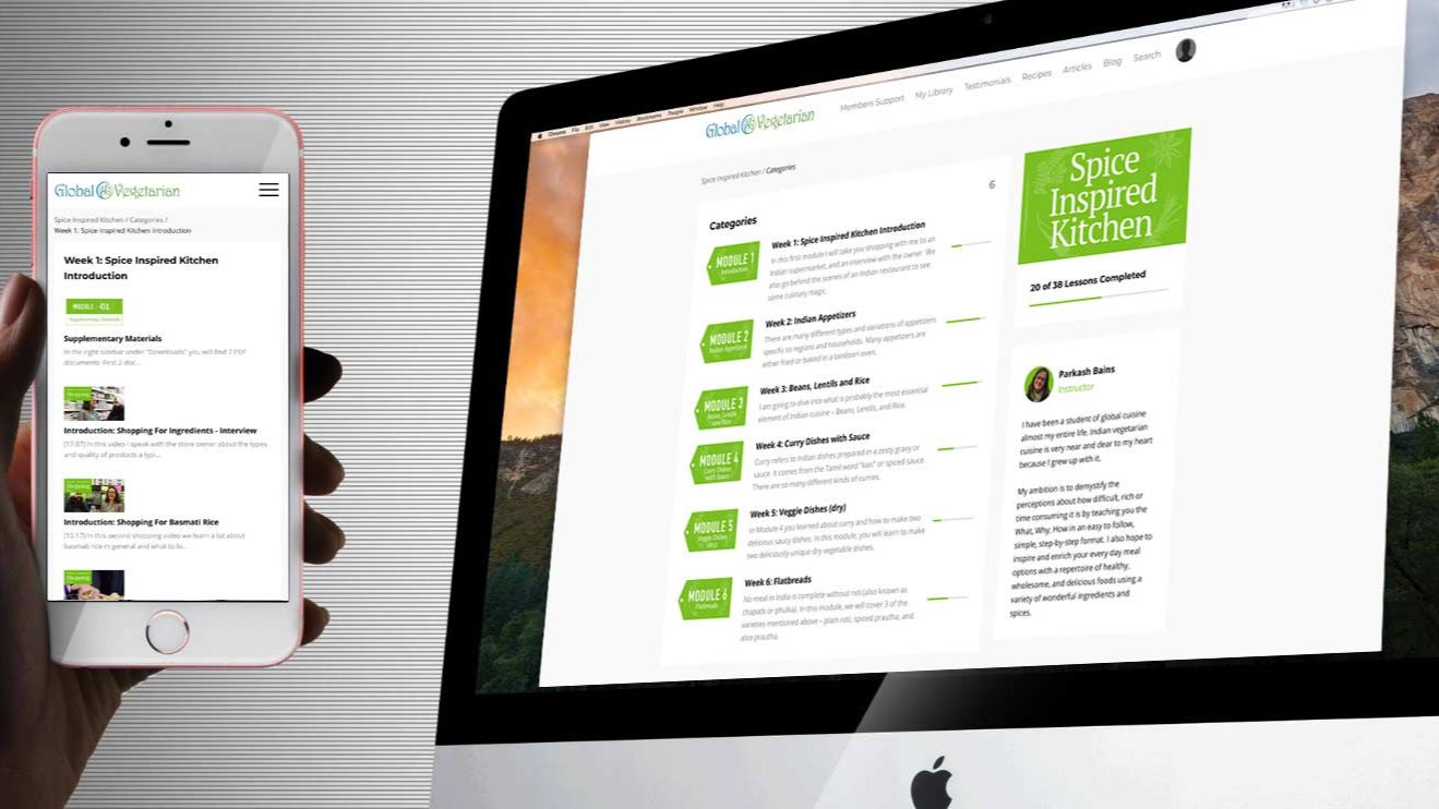
Curriculum section. Module-by-module breakdown. Each module: name + one-sentence description of what the student can do after completing it. Expandable accordions work well here on Kajabi — they keep the page scannable without hiding content.
Instructor section. Photo. Three to five sentences. Credibility tied specifically to this course topic. End with a single sentence that bridges your story to the student's situation.
Testimonials. Three to six is usually the right number for a course sales page — enough to provide social proof without feeling like you're trying too hard. If you're just launching and don't have testimonials yet, beta student feedback or colleague testimonials noting your expertise work as placeholders.
Pricing and enrollment. Clean layout. Price clearly stated. What's included restated briefly. Guarantee noted. One button. Done.
FAQ. Five to eight questions. Anticipate the objections. Be honest.
On Kajabi specifically, all of this can be built using the page editor with minimal custom code. The sections exist. The challenge is not technical — it's strategic. What goes in each section, in what order, and with what message.
The Kajabi-Specific Details That Actually Matter
Since most of my clients build on Kajabi, a few platform-specific notes:
The Offer page is not the Sales page. Kajabi creates these as separate entities. The Sales page is your long-form persuasion page — the one we've been discussing. The Offer page (checkout) is where the transaction happens. Make sure your CTAs throughout the Sales page link to the Offer, not to another internal page.
Use the Theme editor for brand consistency. Setting your fonts and colors once in the Theme editor means every page inherits those settings automatically. This is the most efficient way to maintain a cohesive look across your site without manually styling each section.
Mobile preview is not optional. A significant portion of your visitors will see your site on a phone first. Kajabi's editor shows mobile preview in real time — use it after building each section. Headlines that look clean on desktop often stack awkwardly on mobile. Button sizes that feel comfortable on desktop become too small to tap easily on a phone screen.
Section spacing creates professionalism. The visual difference between a Kajabi site that looks DIY and one that looks premium is often just spacing. Use consistent top and bottom padding on sections (80–100px on desktop is a safe starting point) and give your content room to breathe within each section.
Design Is What Turns Visitors Into Students
A course website isn't just a place to host lessons.
It's a decision environment. Visitors arrive uncertain — curious, maybe, but unconvinced. Every design choice you make either helps them move toward a "yes" or gives them a reason to leave.
The sites that convert aren't necessarily the most beautiful. They're the most clear. Clear message. Clear structure. Clear visual hierarchy. Clear next step.
When you get those fundamentals right — when the hierarchy is obvious, the flow is logical, the typography is readable, and the call to action stands out — something happens that no clever copy can manufacture: visitors understand exactly what you're offering, why it matters to them, and what to do about it. That clarity is what drives enrollment.
Start there. Everything else can be refined later.
If you're planning to launch an online course, the website around the course matters as much as the course itself. Clear structure, strong design, and a focused sales page make the difference between visitors browsing and students enrolling. If you want help designing or improving your course website — whether on Kajabi or WordPress — you can learn more about my services on the Services page, or schedule a short conversation here to discuss your project.